Where it started
OMPP · WOFP is one organization with two acronyms, depending on the language. Under it sit more than twenty bodies with names of their own: Water for Everyone, the Culture of Peace Agency, the World Forestry Organization, Musicians for Peace. Each has its acronym, and most are named in several languages at once.
Every body will get its own website. The domains are in place; the sites aren’t live yet, and building them is our job. Before that, the organization asked us for a cover for each one, so it could present them.
The risk: looking like separate organizations
When every unit makes its own look, it doesn’t take long before they stop seeming related. Here the risk was higher than usual: more than twenty names, long acronyms, and up to ten languages on a single piece.
The job wasn’t to draw a lot of images. It was to make them read as a family when you put them side by side.
Four rules
Nearly all the covers follow the same rules:
- A white frame with rounded corners that holds all the text.
- The acronym or main name in white capitals, the largest thing on the piece.
- The full name underneath, in the languages that apply to that body.
- A background image specific to the subject: water, forest, instruments, the planet.
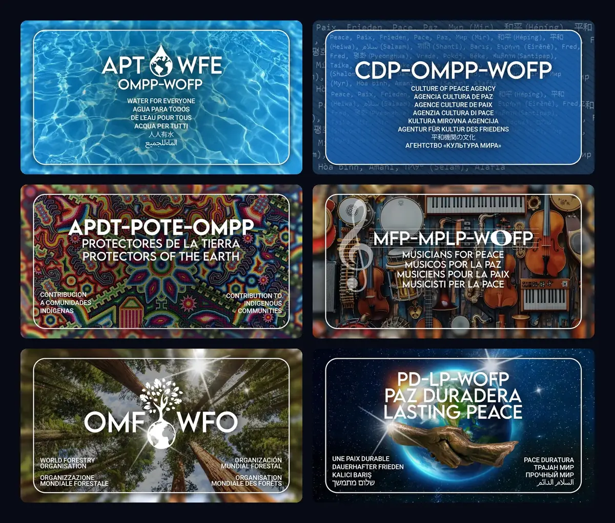
The image is what changes. Everything else repeats. Our design team made the background images, one per body.
Languages inside the image
The name in several languages isn’t decoration: it’s how the organization introduces itself. The Water for Everyone cover carries it in six; the Culture of Peace Agency’s, in eight; Lasting Peace, in ten.
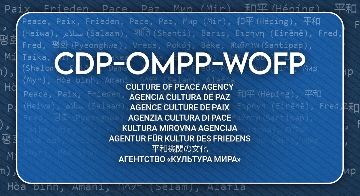
In the language block, each one gets a line, in the same typeface at the same size. None is treated as the main one with the rest as translations. It’s the same approach we take on a website, covered in A multilingual institutional website.
What comes next
The covers date from February 2026. The websites are the next step: one per body, all recognizable as part of OMPP · WOFP.
What we take from it
An identity that keeps growing needs few rules, and they have to be easy to apply. If making the next cover means deciding everything again, there is no system. Four rules are enough for the body that joins tomorrow to get a cover people will recognize.
It’s the kind of problem we work on in branding and identity.