Service · Branding and identity
Branding and identity
We define what the brand is before we draw it. Then we turn it into a system that works the same in a document, on a website or on social media, and in more than one language.
When you need it
Signs your brand needs work.
It changes depending on who uses it
Each team uses a different color, typeface or version of the logo. The brand exists, but nobody sees it the same way twice.
Related organizations that don’t look related
A parent organization with bodies or programs of its own, and no rule for what they share and what they don’t.
A name that doesn’t travel
A brand built for one language that becomes confusing, long or hard to read in the others.
It only exists as an image
The logo is a JPG with a background. It can’t go on a website, in print or on a dark background without being redrawn.
How we work
From the first conversation to the guidelines.
Diagnosis
What exists today: logos, real uses, audiences and languages. What works and what goes.
Territory
What the brand is and what it isn’t. We write it down before drawing, so the design has something to be measured against.
System
Logo and variants, palette, typography and usage rules. If there are bodies or products, how they relate to the parent brand.
Applications
We test it where it will live: the website, documents and social media assets.
Validation
We adjust based on what those tests show, and only then close the guidelines.
What’s included
What you get.
- Territory: the text that defines what the brand is, and a name if one is needed.
- Logo and variants, in vector formats for web and print.
- Palette and typography, with their usage rules.
- Brand guidelines: a document your team can apply without calling us.
- First applications: the real pieces where the brand starts being used.
Where you can see it
One organization and its bodies.
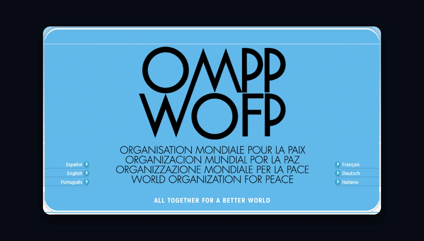
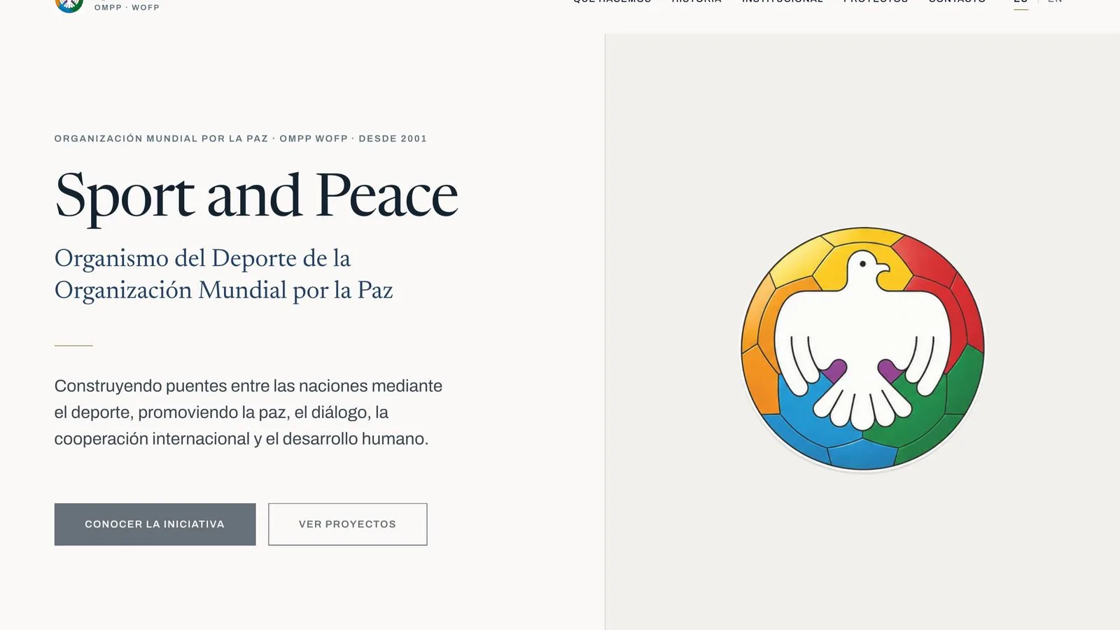
Since 2005 we have worked on the brand of OMPP · WOFP, an international NGO, and later on two of its bodies: Sport and Peace and the International Medical Committee. Each has an identity of its own and presents itself as part of the same organization.
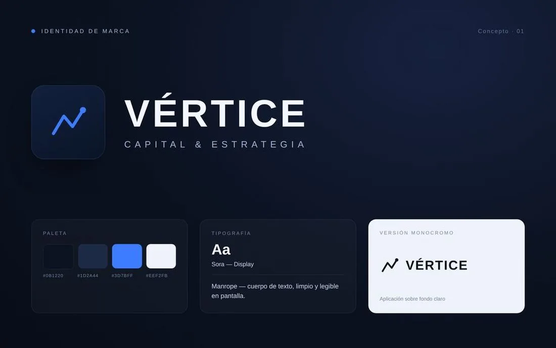
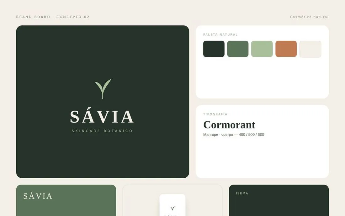
Studio exercises. We also develop identities of our own, with no client behind them, to test system ideas. They are not client work, and they are labeled as such.
The difference
Brand and website at the same table.
Because the same team designs and builds, the brand is tested on the website while it is being made. If a typeface doesn’t read on a phone or a color falls short on contrast, it shows up before the guidelines are closed, not after.
Which brand are you working on?
Tell us what exists today and where it’s used. That’s enough to start.